How to Create User Interfaces with Python Using Tkinter Layouts
Written on
This article is part of the User Interfaces series. If you haven't read the first installment on Tkinter, you can find it here:
Creating User Interfaces with Python
Python is a versatile programming language widely used in fields such as data science and web development. However, its capabilities extend beyond that.
Layouts play a crucial role in UI development, allowing you to organize elements in a desired, structured manner. You can dictate where widgets are placed within a parent or top-level window.
Tkinter offers three layout managers, and we will explore each of them.
The foundational code for this discussion is as follows:
import tkinter as tk
main_window = tk.Tk() main_window.title("Layouts") main_window.geometry("400x400")
label1 = tk.Label(main_window, text="Label 1", bg="red") label2 = tk.Label(main_window, text="Label 2", bg="green")
main_window.mainloop()
Using the Pack Manager
The first layout manager we will examine in Tkinter is pack. In prior discussions, we utilized pack without any parameters, but customization is possible by adding specific parameters.
Let's start with padding parameters, which create space between the widget and its border. There are two options:
- ipadx: horizontal padding.
- ipady: vertical padding.
For instance:
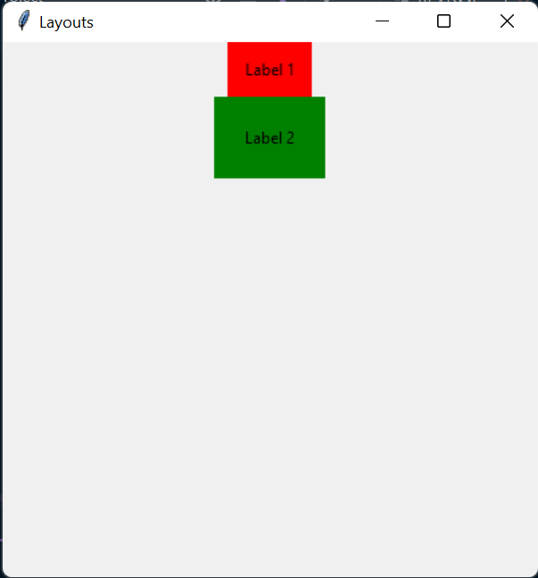
label1.pack(ipadx=10, ipady=10) label2.pack(ipadx=20, ipady=20)
This will result in:
Next, we introduce the fill parameter. This allows widgets to occupy available space along the x-axis, y-axis, or both. Acceptable values for this parameter are x, y, and both.
For example:
label1.pack(fill='x') label2.pack(fill='y')
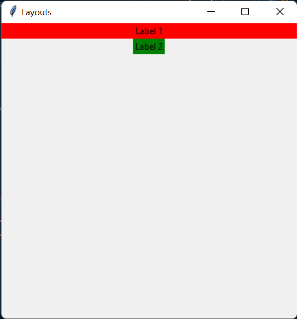
Why might the second label not occupy the entire vertical space? By default, widgets do not fill all the vertical space, but they do for horizontal space, which is why fill='x' functions effectively.
To alter this behavior, add another argument: expand=True.
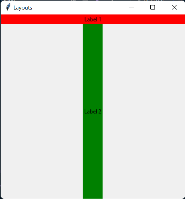
label1.pack(fill='x') label2.pack(fill='y', expand=True)
The expand=True option allows the widget to utilize all available space. You can also apply it without fill, and it will still occupy all available space.
If both widgets utilize expand, they will share the space evenly:
label1.pack(expand=True) label2.pack(expand=True)
Next, we have the side parameter, allowing you to determine widget alignment. You can use it with left, right, top, and bottom.
label1.pack(expand=True, side='left') label2.pack(expand=True, side='left')
In summary, pack is valuable when you aim to display widgets vertically or side by side.
Utilizing the Grid Manager
This layout manager enables you to arrange widgets in a grid format. You can configure the indexes and weights of rows or columns, where weights determine the width of the columns or height of the rows.
container.columnconfigure(index, weight) container.rowconfigure(index, weight)
Then, you can position widgets in the grid by invoking the grid method and supplying the appropriate indexes:
label1.grid(row=0, column=0) label2.grid(row=0, column=1)
To have a widget span multiple columns, use the following parameters:
label1.grid(row=0, column=0, columnspan=2) label2.grid(row=1, column=0) label3.grid(row=1, column=1)
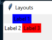
As illustrated, "Label 1" spans across a second cell. By default, it is centered, but you can adjust alignment using the sticky parameter:
label1.grid(row=0, column=0, columnspan=2, sticky="e")
The sticky value determines where the widget will "stick" (e.g., "e" for east, "w" for west, and so on).
You can also combine directions to allow the widget to fill the space. For instance, sticky="ew" will enable the widget to fill the grid from east to west. This should be paired with columnspan or rowspan for proper expansion.
Additionally, padding can be added to widgets, either externally or internally:
label1.grid(row=0, column=0, columnspan=2, padx=50, ipady=10) label2.grid(row=1, column=0) label3.grid(row=1, column=1)
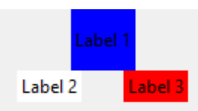
Using the Place Manager
The final layout manager, place, is less commonly used. It's beneficial when precise positioning of widgets is necessary. Here's an example:
label1.place(x=10, y=10, width=100, height=100) label2.place(x=150, y=10, width=100, height=100) label3.place(relx=0.5, rely=0.5, anchor="center", width=100, height=100)
The parameters available with place include:
- x/y: absolute widget position.
- width/height: widget dimensions.
- relx/rely: relative widget position.
- anchor: reference point for placement. For instance, if anchor="center" is used, the center will align with the specified coordinates.
Thus, the above code will display:
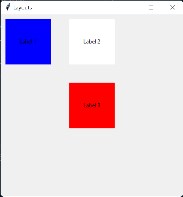
This layout manager can be particularly useful for applications allowing users to position widgets freely, such as in a drawing application.
A Quick Exercise
To test your understanding, try to recreate the window shown below:
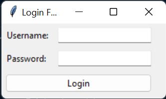
If you encounter any difficulties, the solution can be found in the project repository at this link in LoginFormApp.py. You'll also see the use of Tkinter enumerations and an object-oriented design.
Final Thoughts
If you'd like to stay updated with future installments of this series, be sure to follow me.
Also, check out: Building User Interfaces with Python for more insights into Python UI development.
You can find the other stories in this series here:
Creating User Interfaces with Python
Python is a versatile programming language widely used in fields such as data science and web development. However, its capabilities extend beyond that.
To delve deeper into my Python stories, click here!
If you enjoyed this article, don't forget to clap and consider following me for more content :)
You can subscribe via email to receive notifications of my latest stories—just click here!
If you're not yet subscribed to Medium and wish to support me or access all my stories, please use my link:
Join Medium with my referral link — Esteban Thilliez
Read every story from Esteban Thilliez (and thousands of other writers on Medium). Your membership fee directly supports me and other creators.